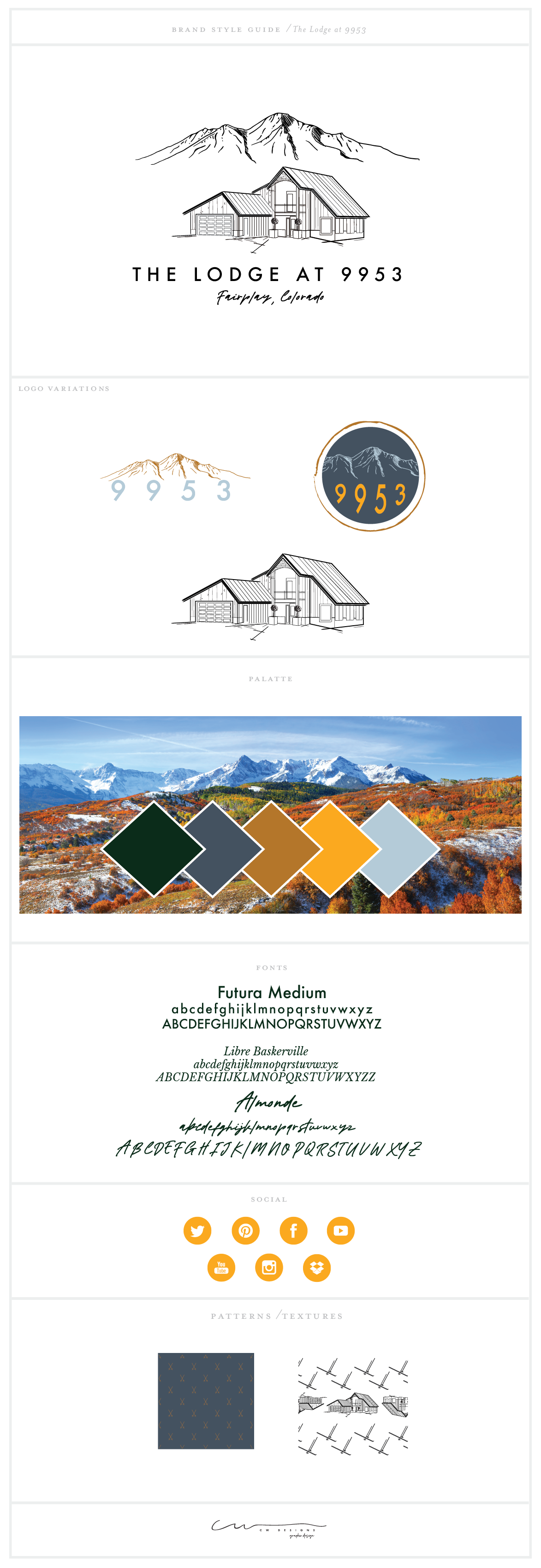
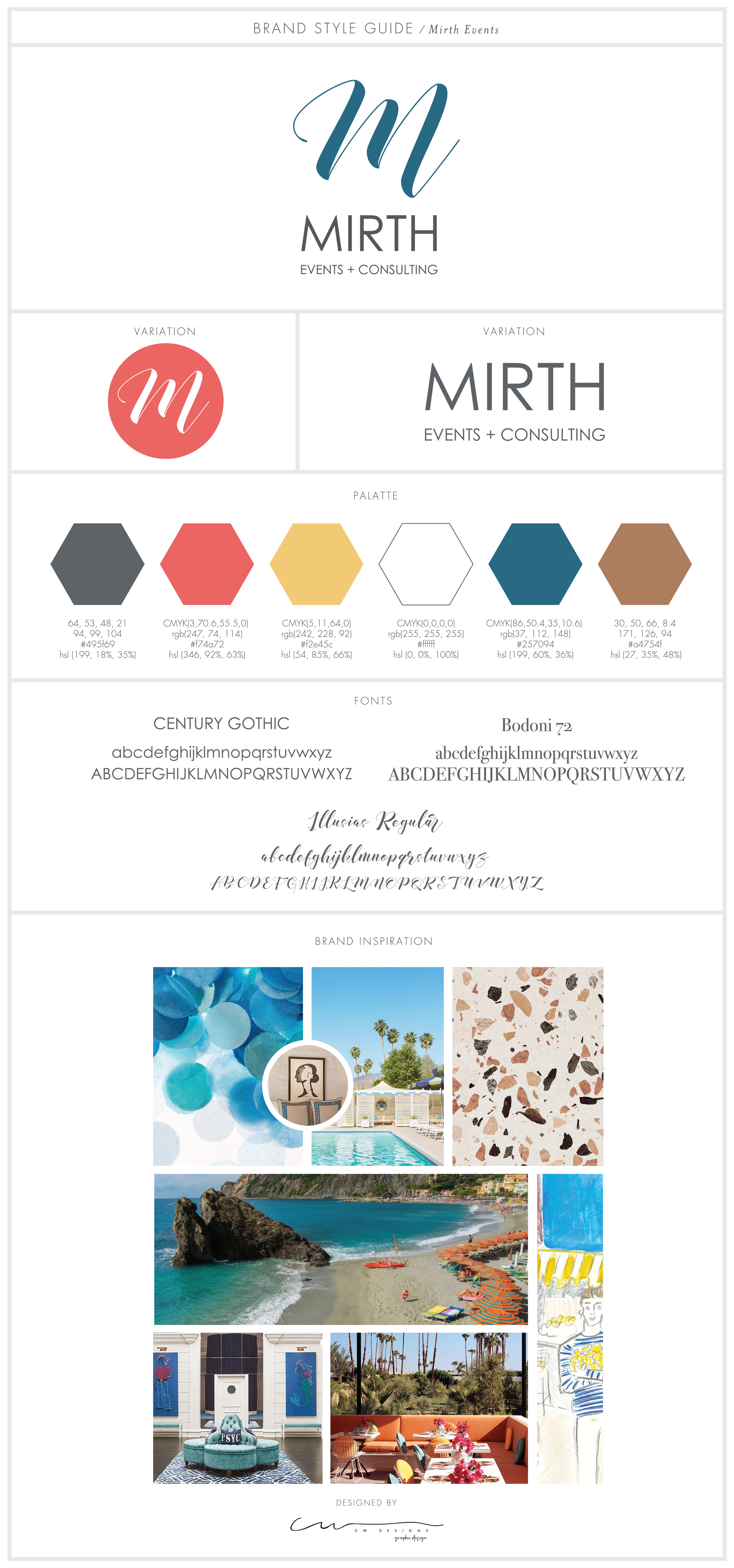
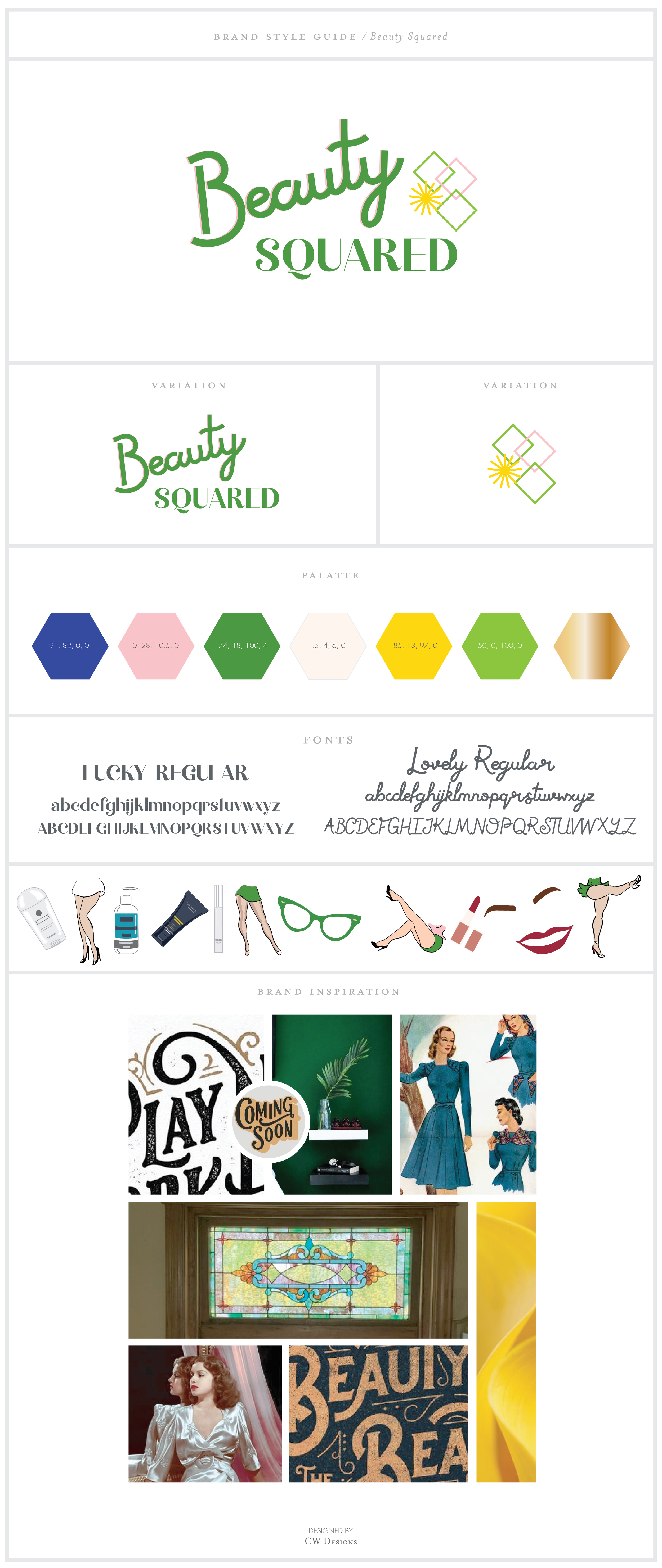
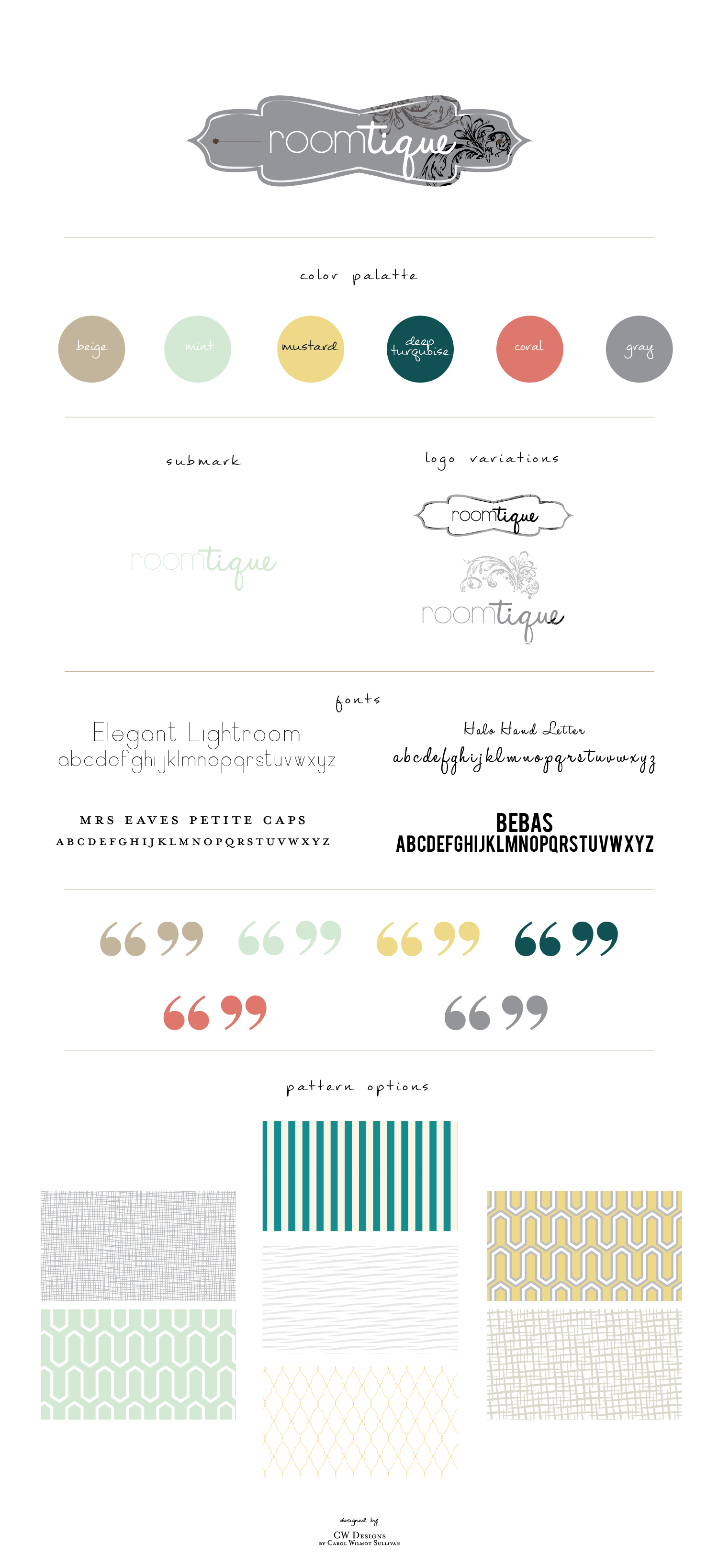
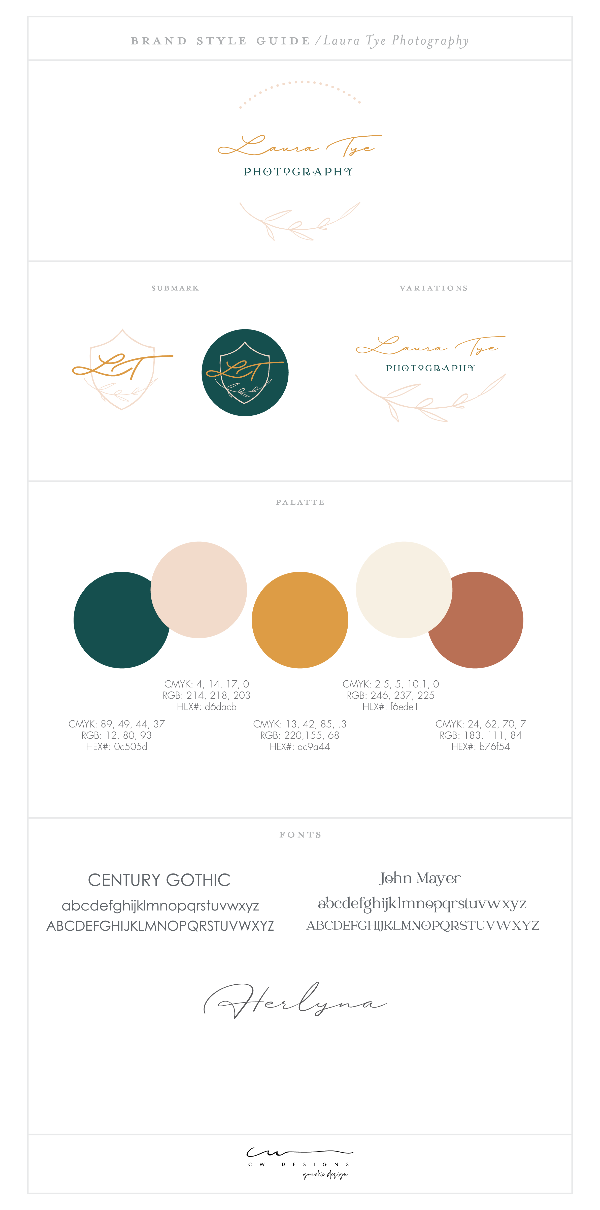
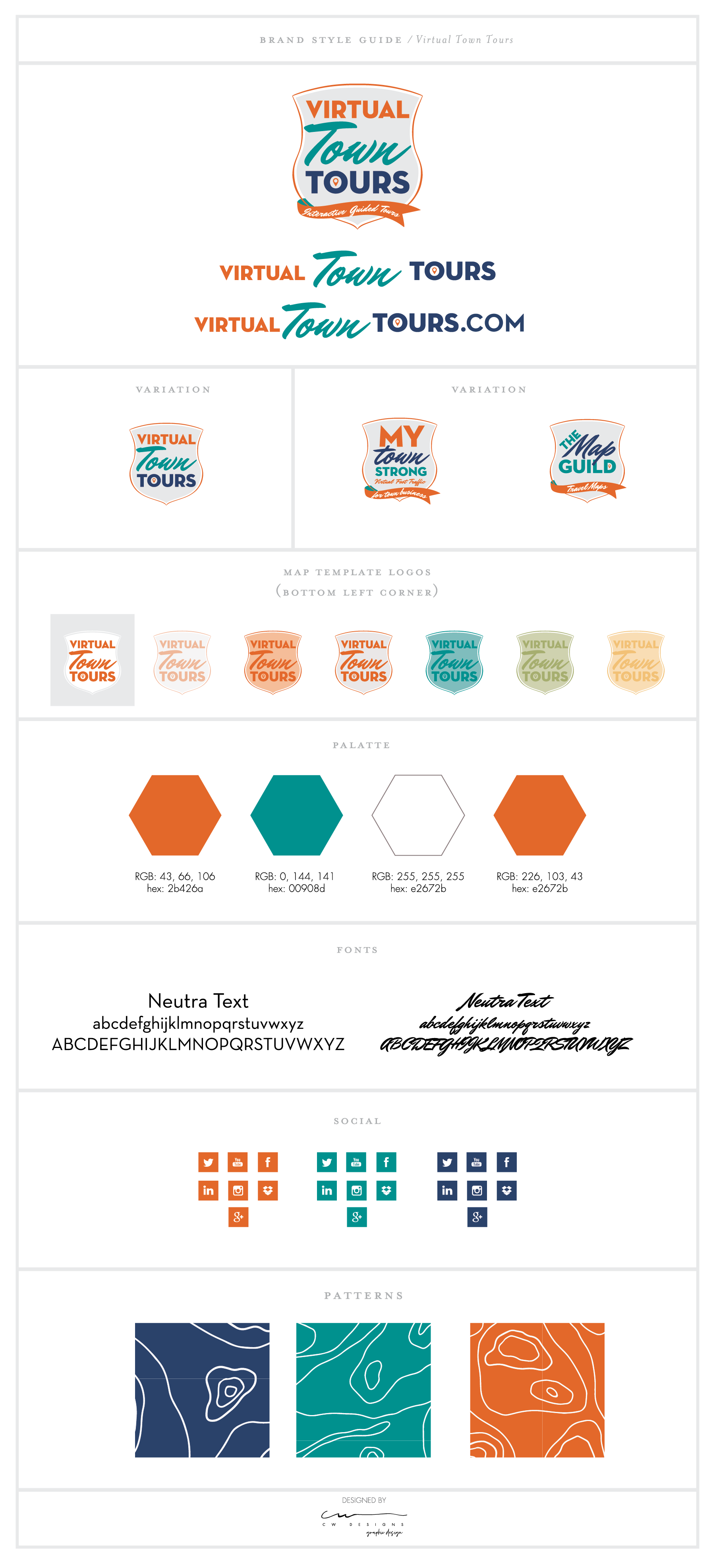
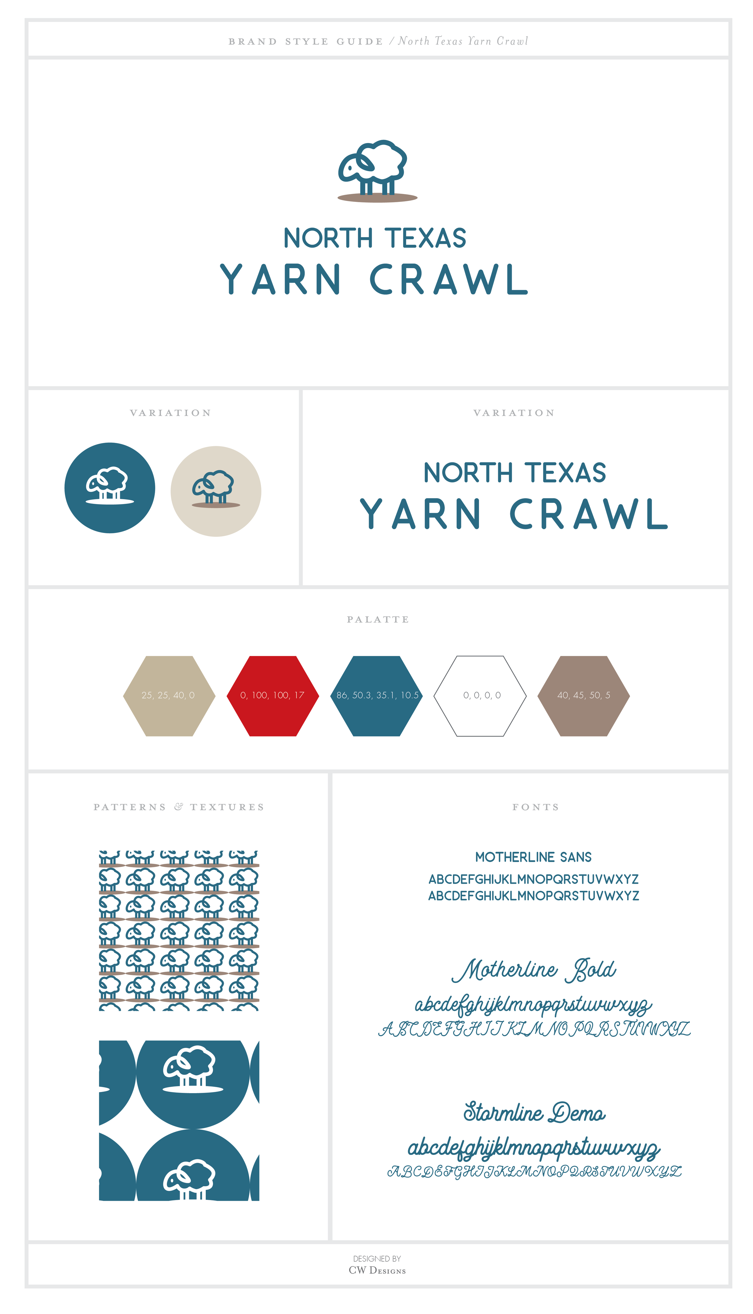
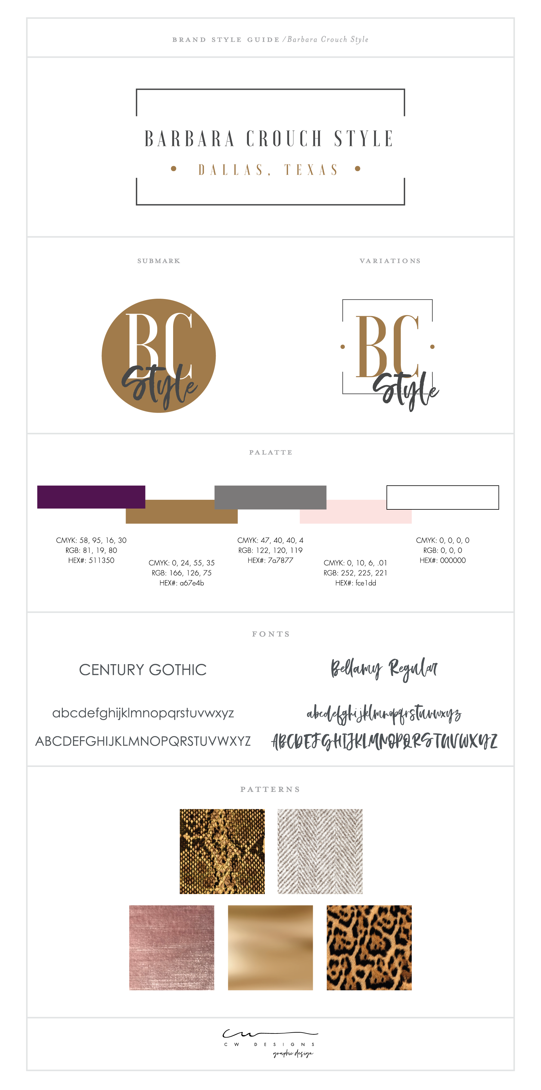
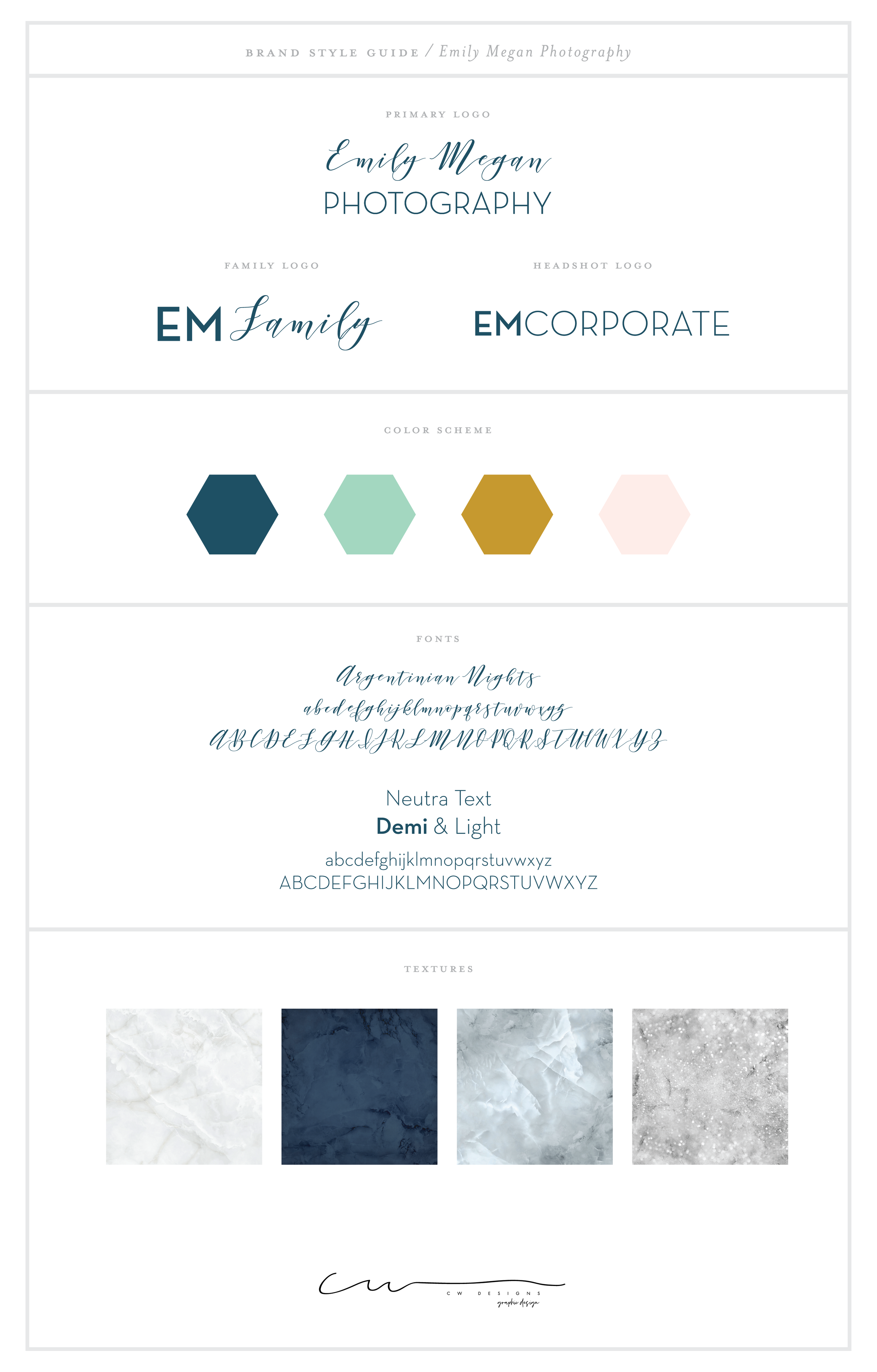
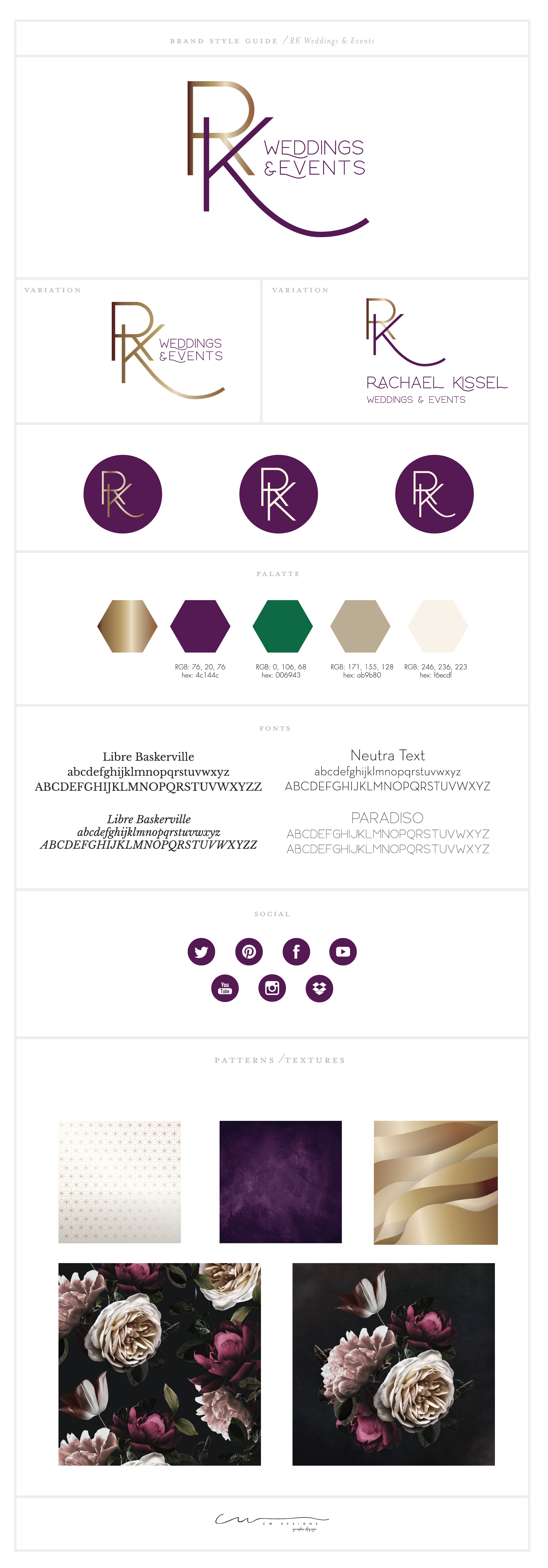
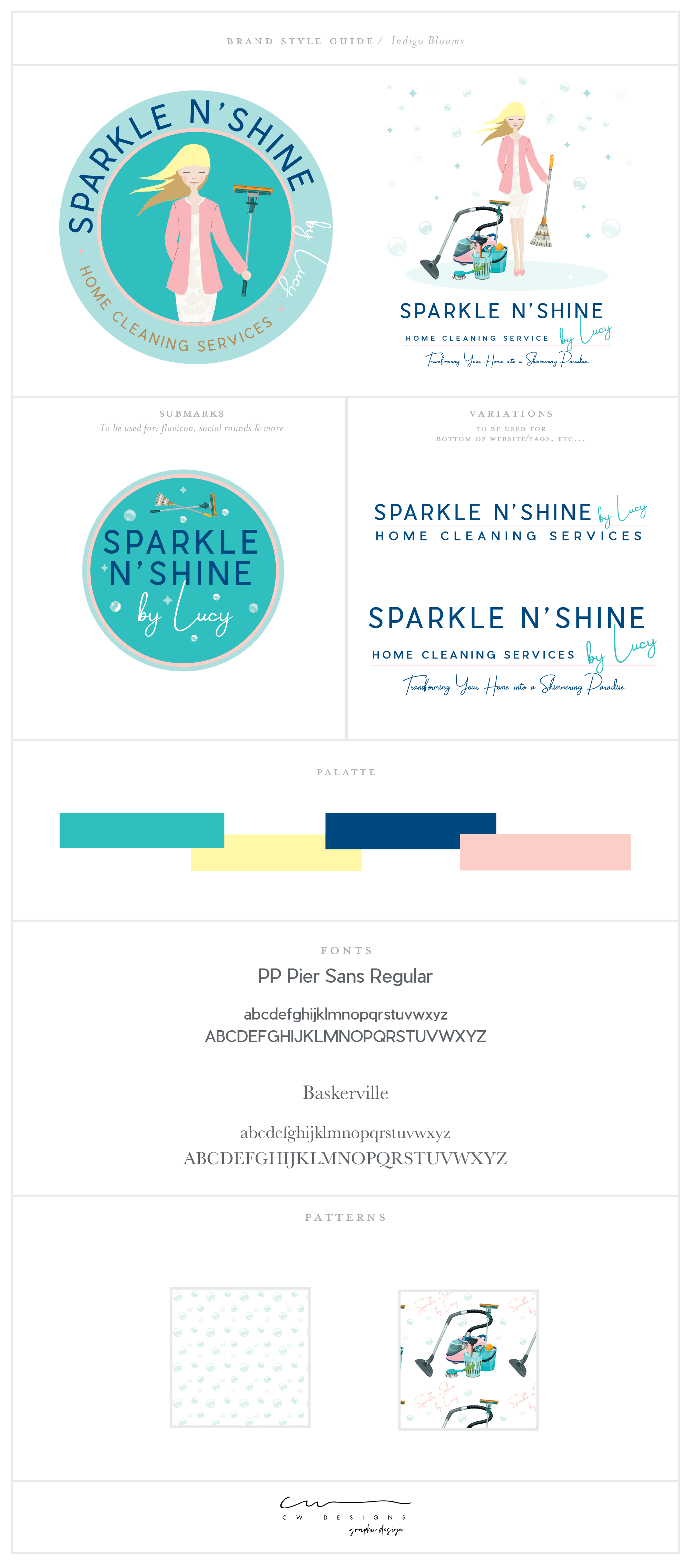
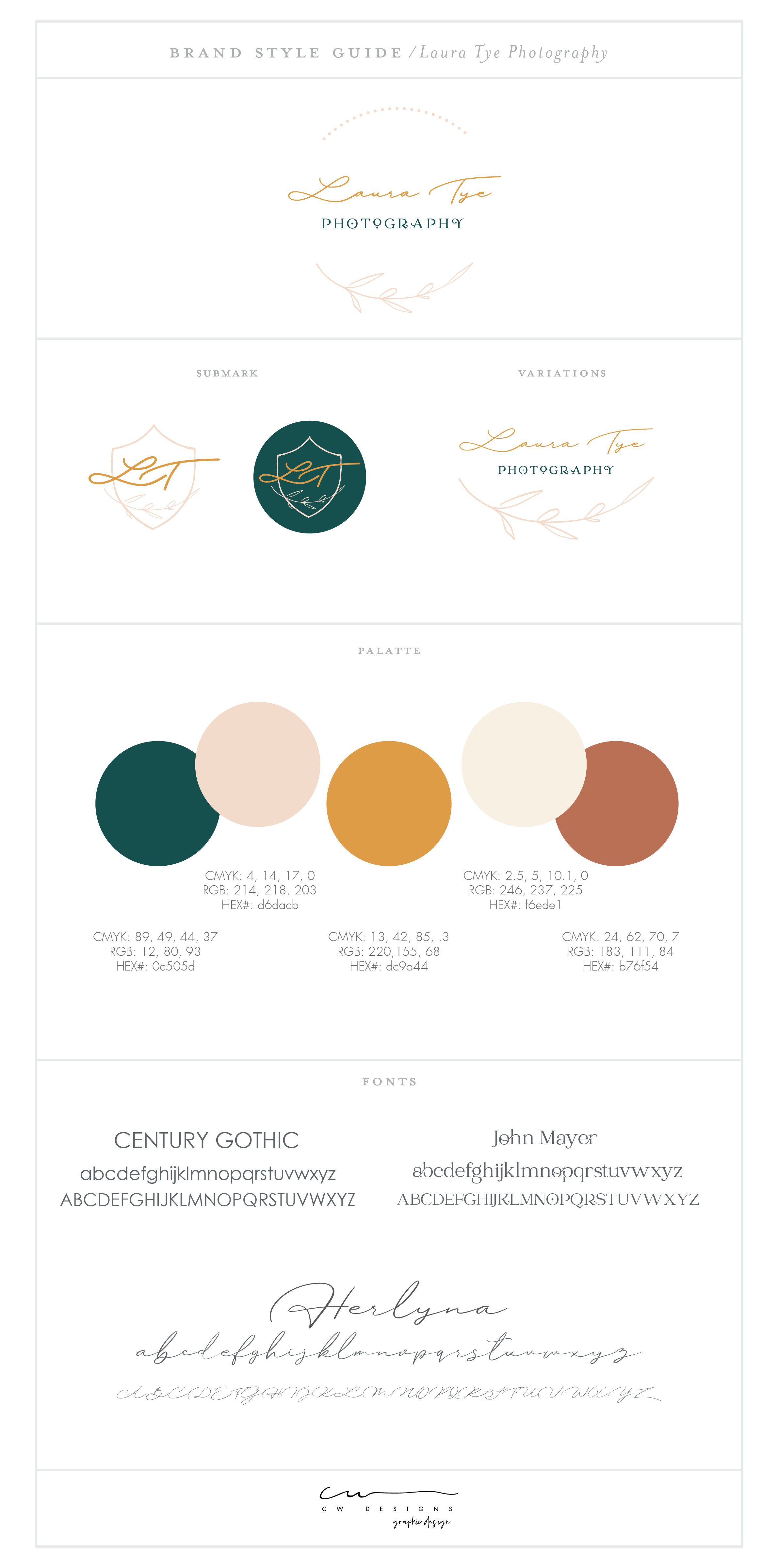
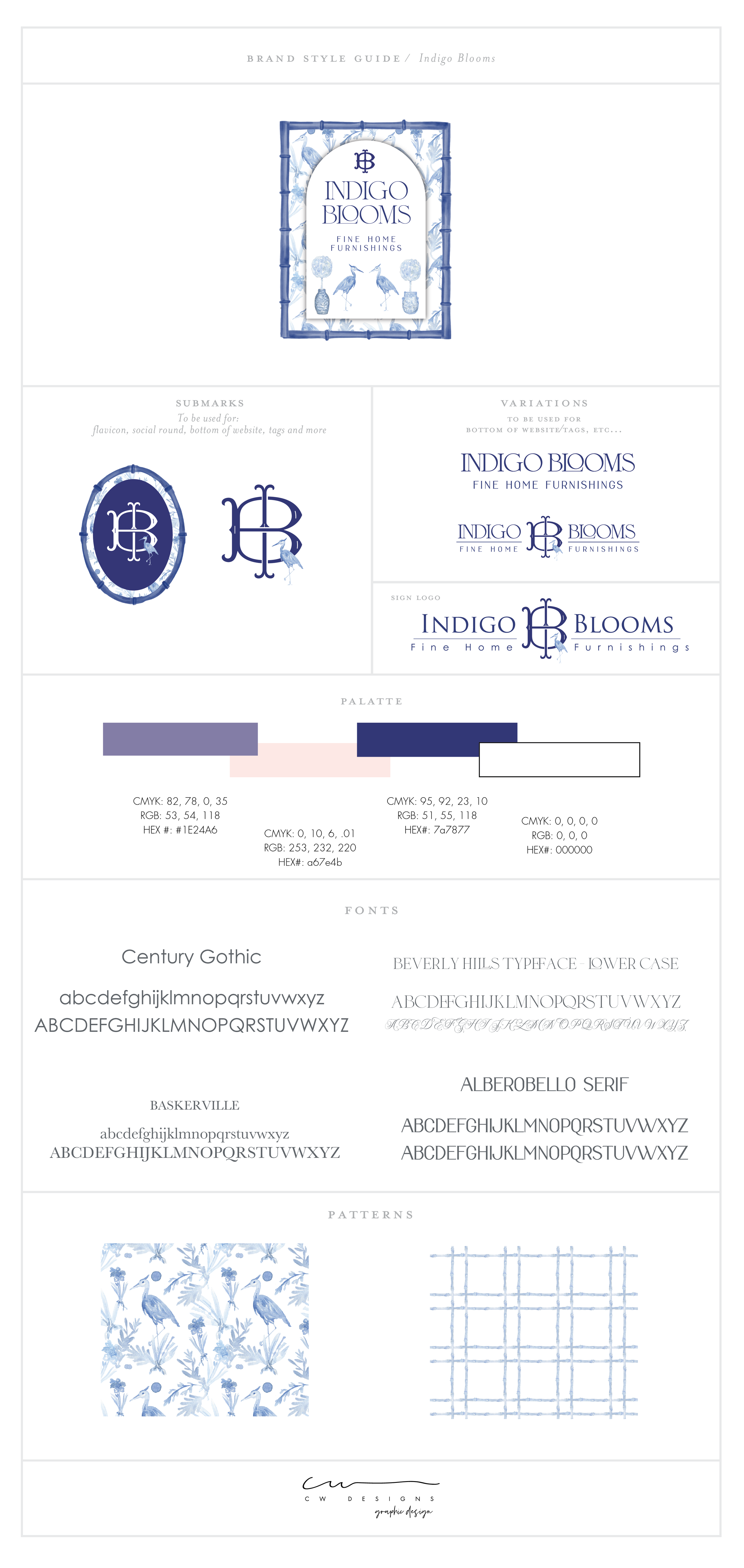
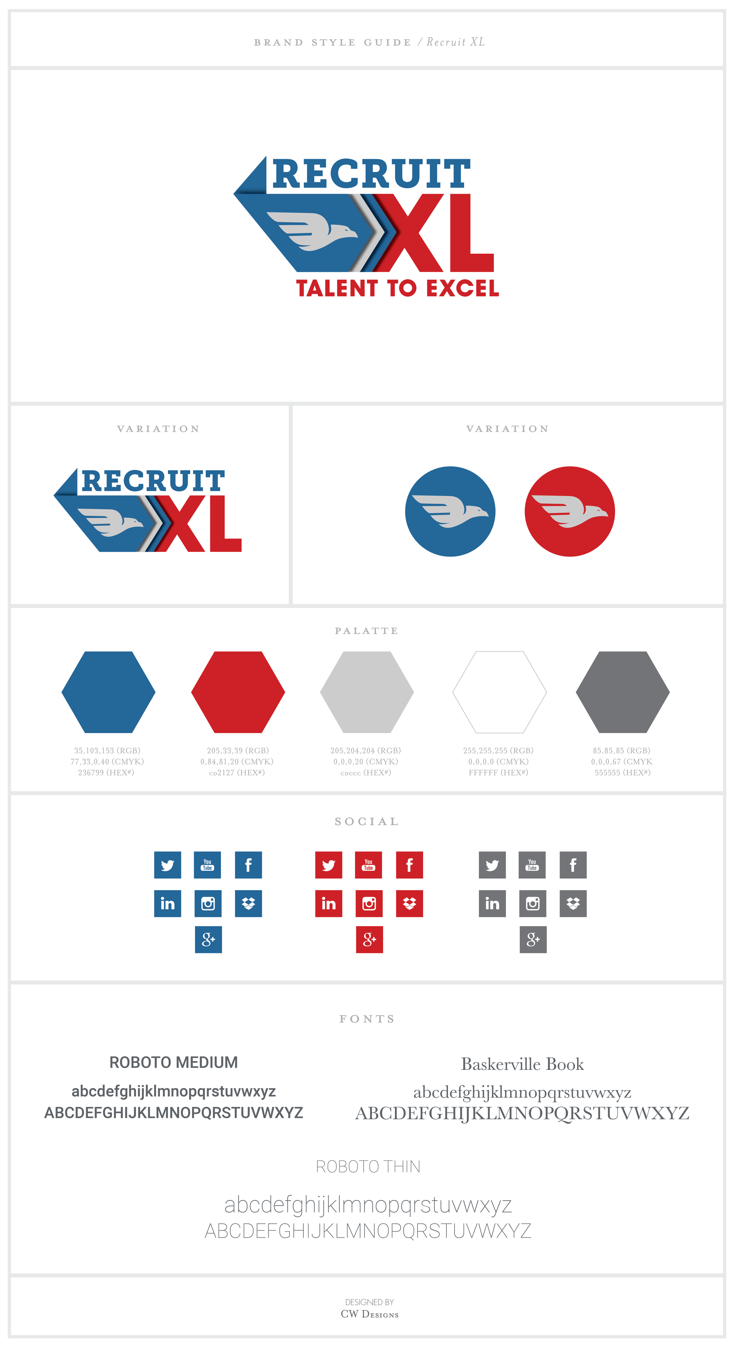
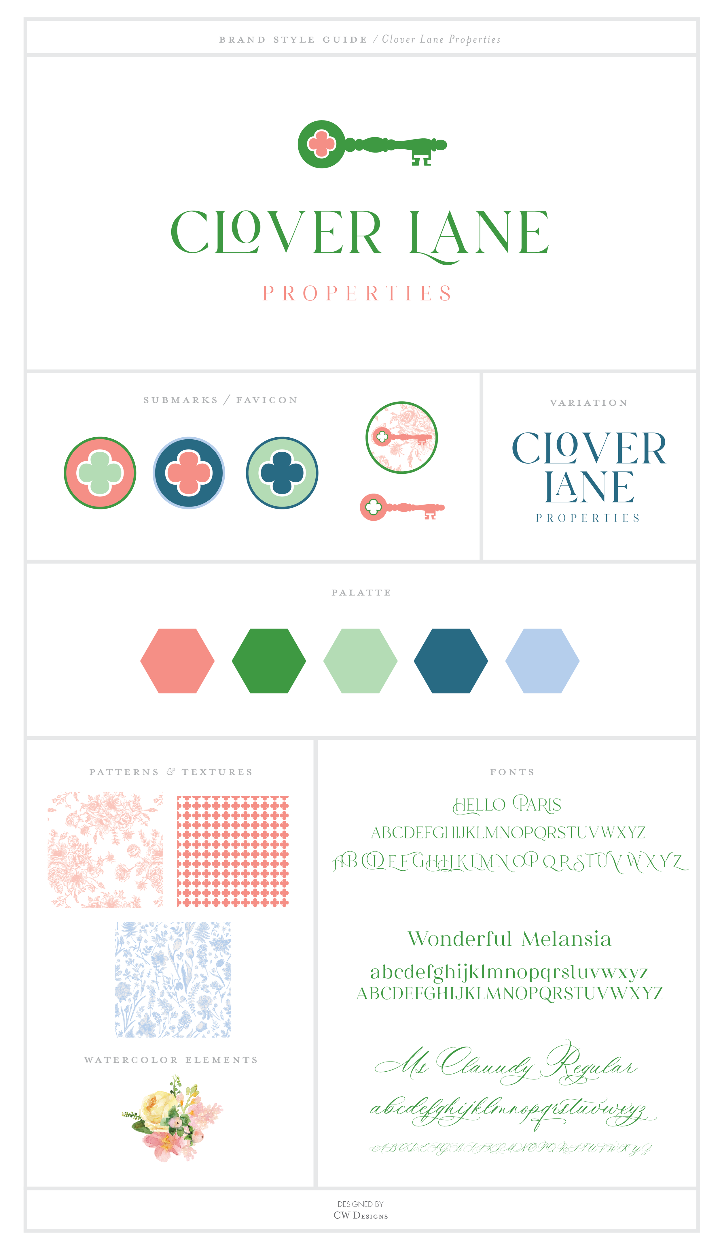
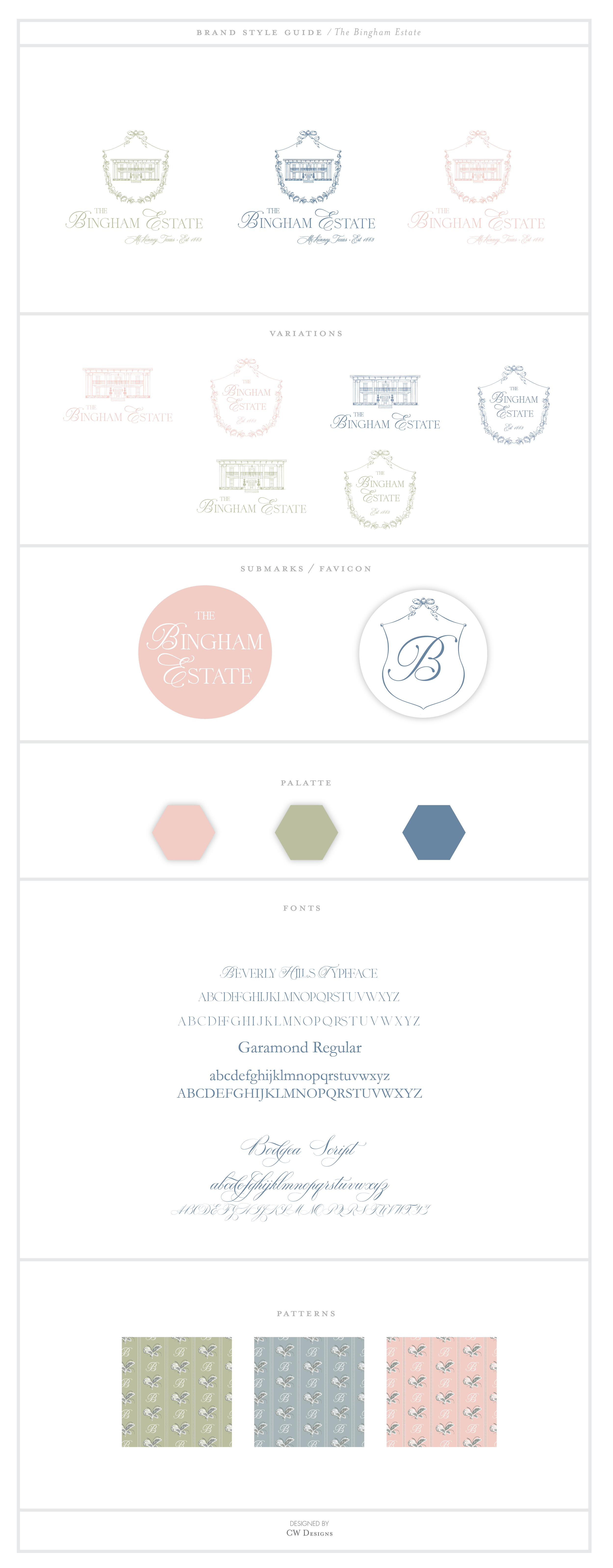
Nurturing and solidifying a brand name or a business to attain its highest potential requires a well-planned and designed brand board. A brand board is the core of a brand's identity, and is the guide businesses use to effectively communicate with their target audience.
Through a brand board, a brand's values and attributes are communicated to the outside world. A client gets a clear picture of what a brand stands for and what they have to offer. Moreover, you have a template with which to follow where you can easily find the color codes, typeface, and social media imagery.
In one neat document, it displays to you all the critical elements of the visual brand. They act as guidelines to the visual decisions a brand makes. Essential elements that reassure your brand's consistency in style with your target audience include:
Primary logo
The primary logo is technically the face of the brand. They are mostly used on the brand's website and PDFs. Clients will judge and connect with your brand depending on your primary logo.
Brand boards are totally different to style guides, so try not to confuse the two.
Logo variation
It is always safe to have a logo that slightly differs from the main logo since primary symbols will not always suit all the brand’s activities. The logos' variations are achieved using different colors, shapes, or textures on the primary logos.
Submark
Though normally pulled out from the primary logo, it’s usually smaller in size than the main logo. It’s an important feature used for watermarking brands and often used as a brand's profile picture and the primary identity.
Favicon
A favicon is a small 16×16 pixel icon that serves as branding for your website. Its main purpose is to help visitors locate your page tab easier when multiple website tabs are open. Due to their tiny size, favicons work best as simple images or one-to-three characters of text. Favicons are not to be confused with logos but are sometimes the same. Due to its small size and resolution, the favicon may need to be a simplified version of your logo or a recognizable alternate brand image.
Color palette
This element's purpose is to reinforce the nature of a brand. Bold colors tend to suggest seriousness, a degree of power and authority typically used in corporate firms. Bright, fancy colors tend to be used in firms that sell beauty products.
patterns & Textures
Supportive patterns tend to increase the visual appeal in a brand board. Floral prints are used by firms that deal with a feminine target audience.
Typography
Style and arrangement of letters used in a brand board are of great importance as they influence an individual’s visual decision. It is advisable to use two fonts in a brand board; too many fonts may end up making a brand board look messy and disorganized. It’s always crucial that the type of font and the name of the font used get indicated.
Icons and graphics
Always ensure that the icons and graphics are impressive, appealing to the eye, and relevant to your brand's identity. Never make them too complicated or ambiguous, as they may end up confusing your target audience. It’s an essential feature in a brand board as it tends to complete the visual elements.
Images and inspiration
These are the ideal images that will always represent a brand when it shows up online. Quality and clear images will get you positive engagements from potential clients. Unique and relevant photos are a core brand identifier and allows your customers to quickly identify your brand.
Exceptional value
Investing in your brand identity with a custom brand board saves you time, money, and unifies your message resulting in increased customer engagement and revenue. Explore our branding boards and see how they have helped other small businesses. Beautiful in simplicity, our customized brand board boldly displays your brand and gives you confidence to achieve your marketing goals!


